ECO-STYLIST
My task was to analyze and improve ECO-STYLIST.COM using UX/UI design methodology
Previous ECO-Stylist homepage
ECO-STYLIST is a website about sustainable fashion that:
Rates different brands according to how ethically and sustainably made their clothing is.
Offers a shopping section (that leads the user to a brands website to complete their purchase externally).
Has a blog to help people stay informed about ethically made clothing and sustainable fashion.
As well as offers personal stylists for hire (though you may not even realize this at first glance).
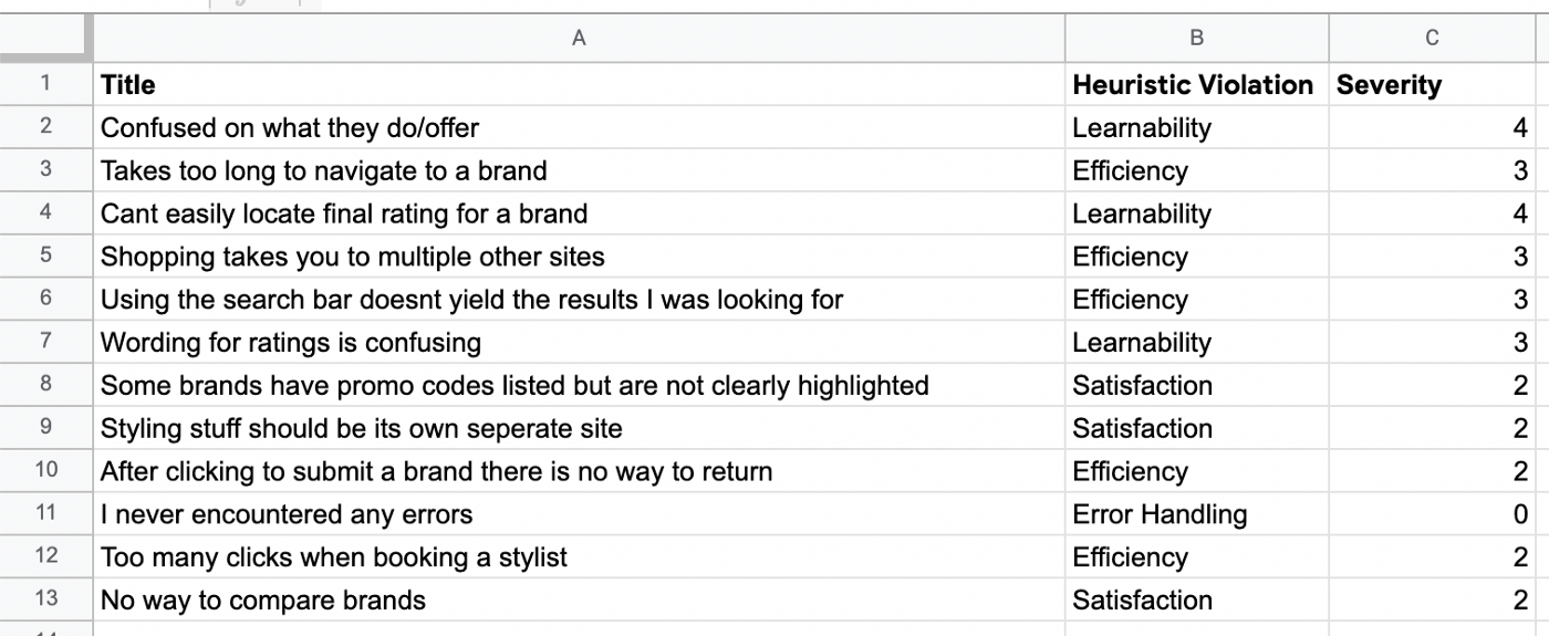
First I began with heuristic analysis of ECO-STYLIST.com. In my findings I felt that the site was confusing in terms of the delivery of their content and unclear in terms of what services they offered.
My findings following heuristic analysis
Then I set out to give users a test of the site to validate or invalidate my findings.
5 tasks were prepared for participants to attempt to complete on ECO-STYLIST. While testing users I took note of how many clicks and how long it took them to complete each task.
I also took note of any insights provided during our interviews.
While conducting usability testing with 5 volunteers I wrote down key pain points for users and then made an affinity map using that information.
All the users that participated in my tests had some issues related to the shopping aspect of the site.
I received the following quotes:
“I don’t understand these ratings tiers”- Sarah (age 34)
“Nothing that I want is in stock”- Stacy (age 28)
“I wish I could just buy these things through this site and not be redirected”- Kirsten (age 37)
“Is there no way to buy from different brands at the same time?”- Adam (age 32)
“I need to find the sales”- Barbara (age 45)
I then plotted down the pain points of a user a created the following journey map.
Three personas to represent different types of users of ECO-STYLIST.com
Then I started with some low fidelity wireframe sketches done with pen and paper. Due to time constraints I wanted to focus on making an e-commerce shop that encompasses and different brands’ items on one store so that users can compare and shop ethically certified brands all in one place. I also wanted to make ECO-STYLIST’ mission clear to the user and showcase what they offered to the user.
Previous design
By making a simple change to the wording of the rating tier from just “certified” to “bronze” it removes the ambiguity that was confusing users.
Updated design
The design tool “figma” was used to recreate my sketched wireframes into higher fidelity.
I then transitioned those wireframes into an interactive prototype to test how users would interact with my designs.
A user flow was made of a search to show how I planned to improve the search function using filters before it is performed.
Filters allowing users to search only in the section they choose — Search results
The ability to read and write reviews was added as well to aid in helping the user to feel comfortable when purchasing items
Next Steps:
Continue to develop this prototype and eventually transition to a high fidelity build
Keep testing and validating or invalidating my designs
Iterate on designs following feedback I receive through user testing


